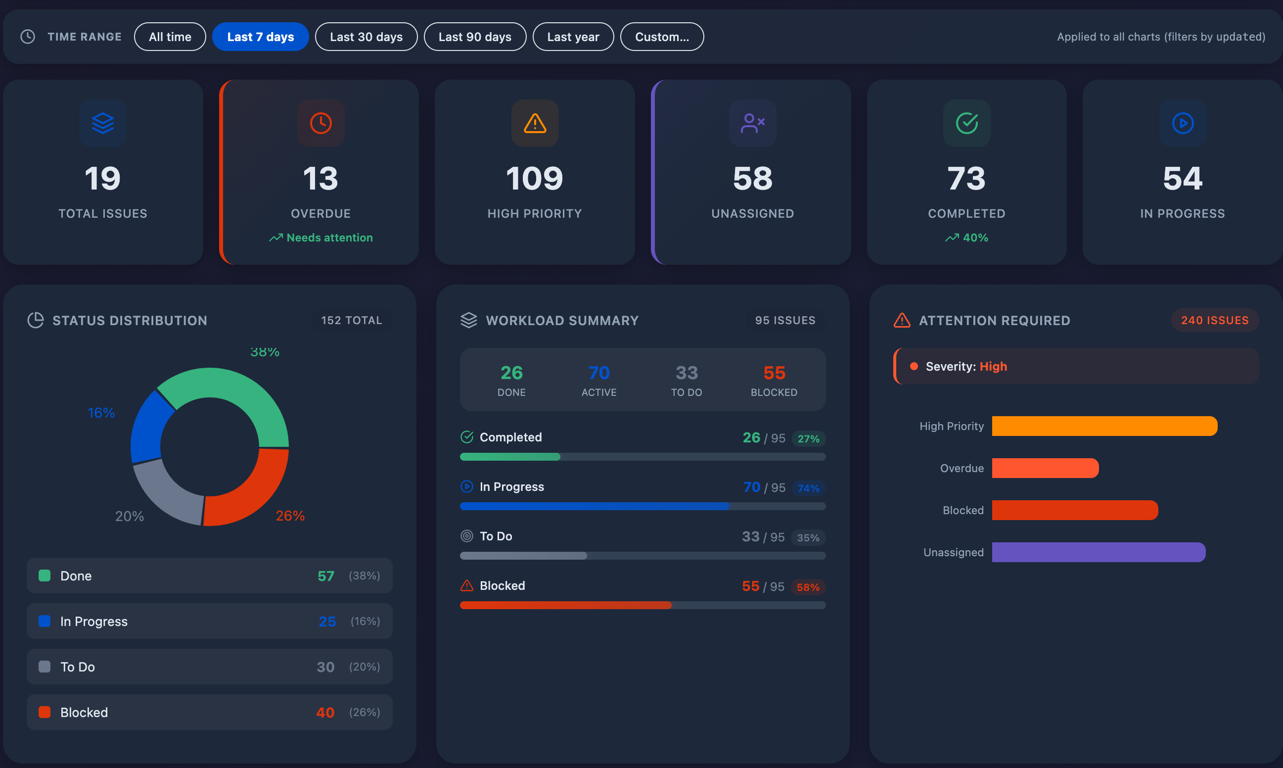
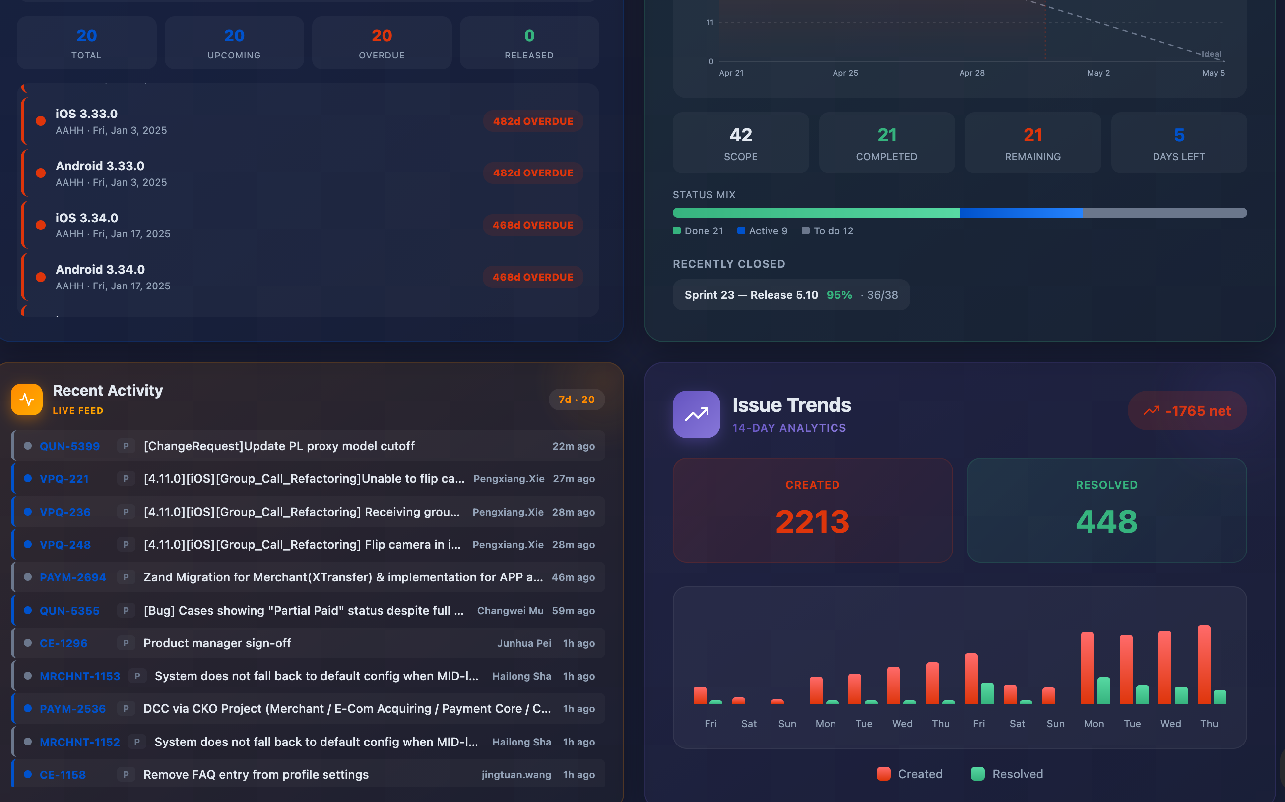
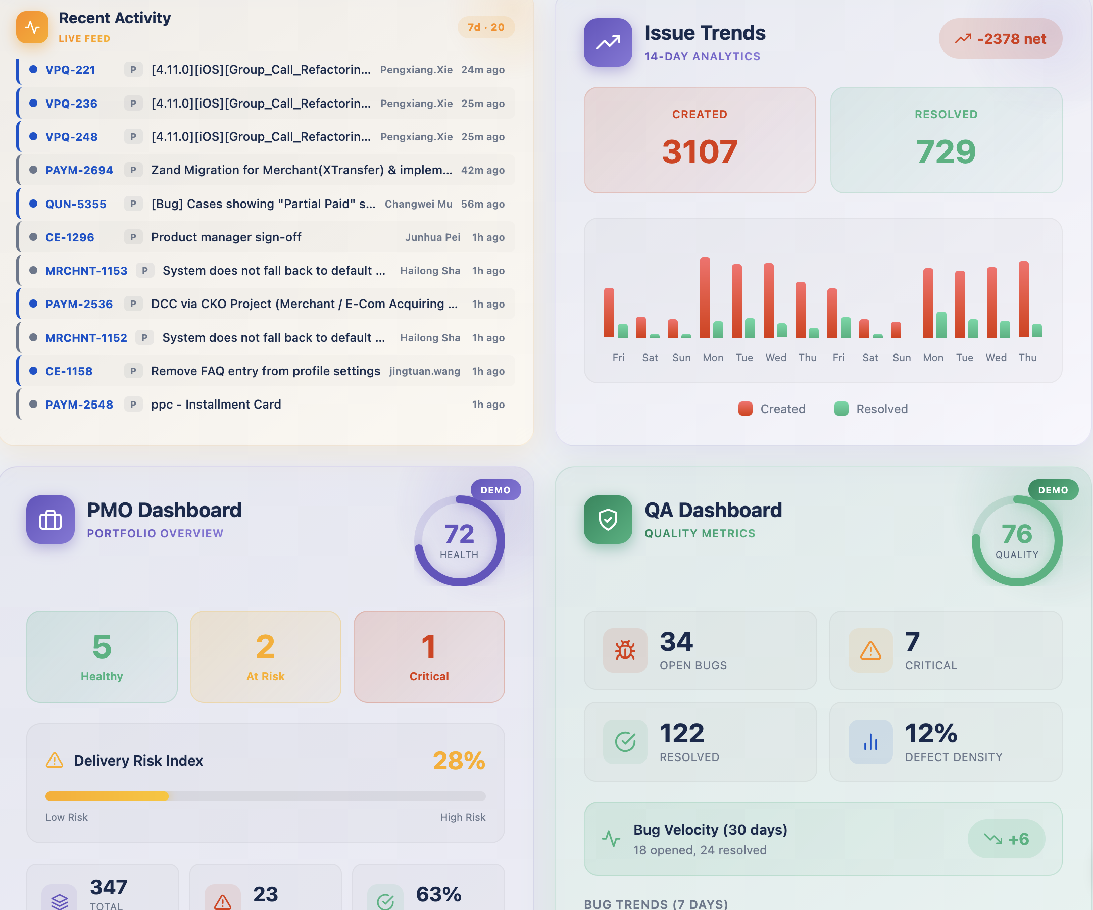
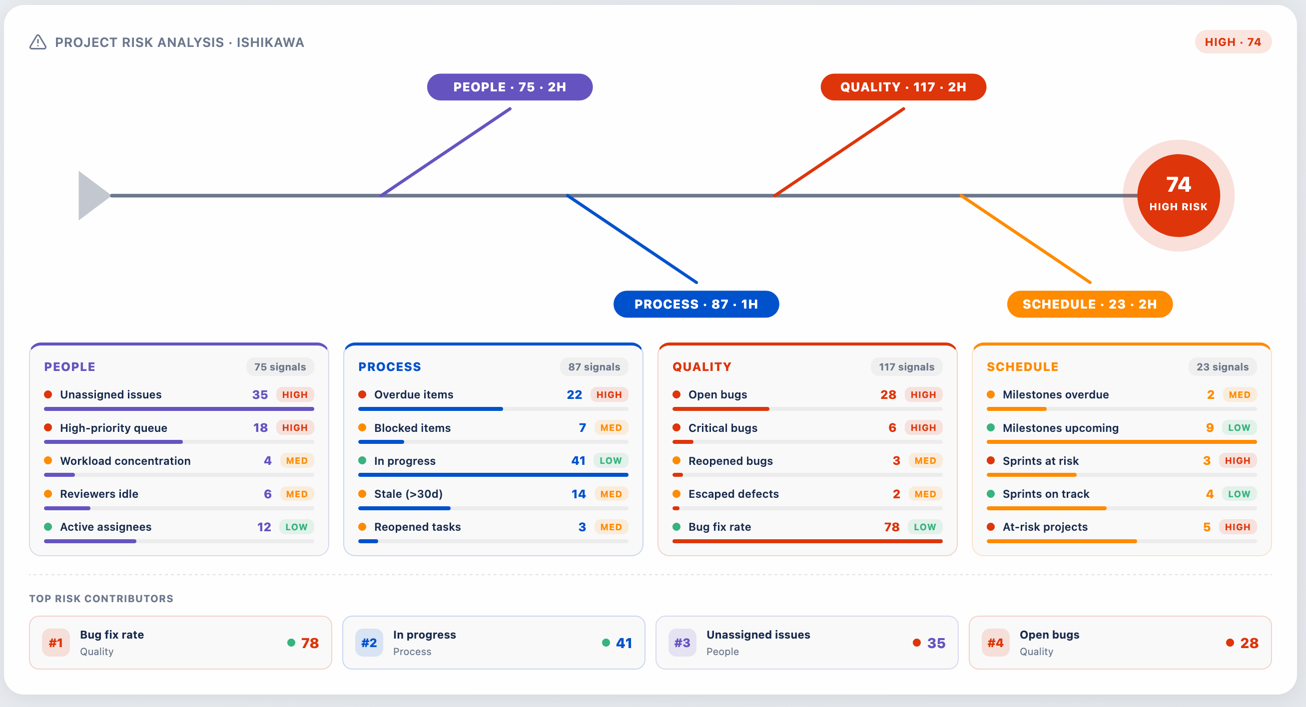
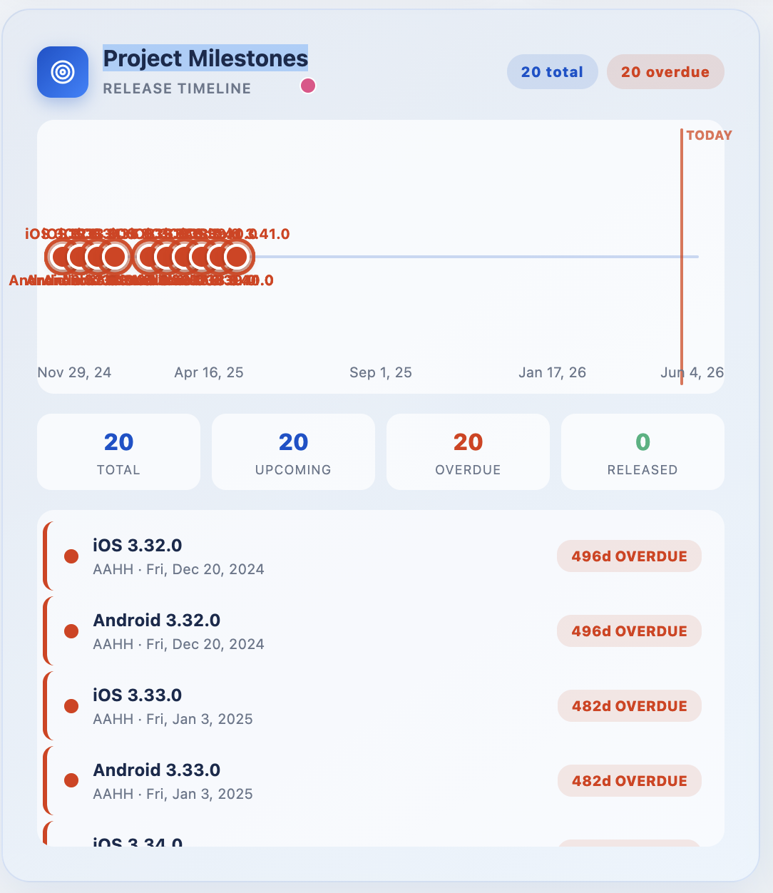
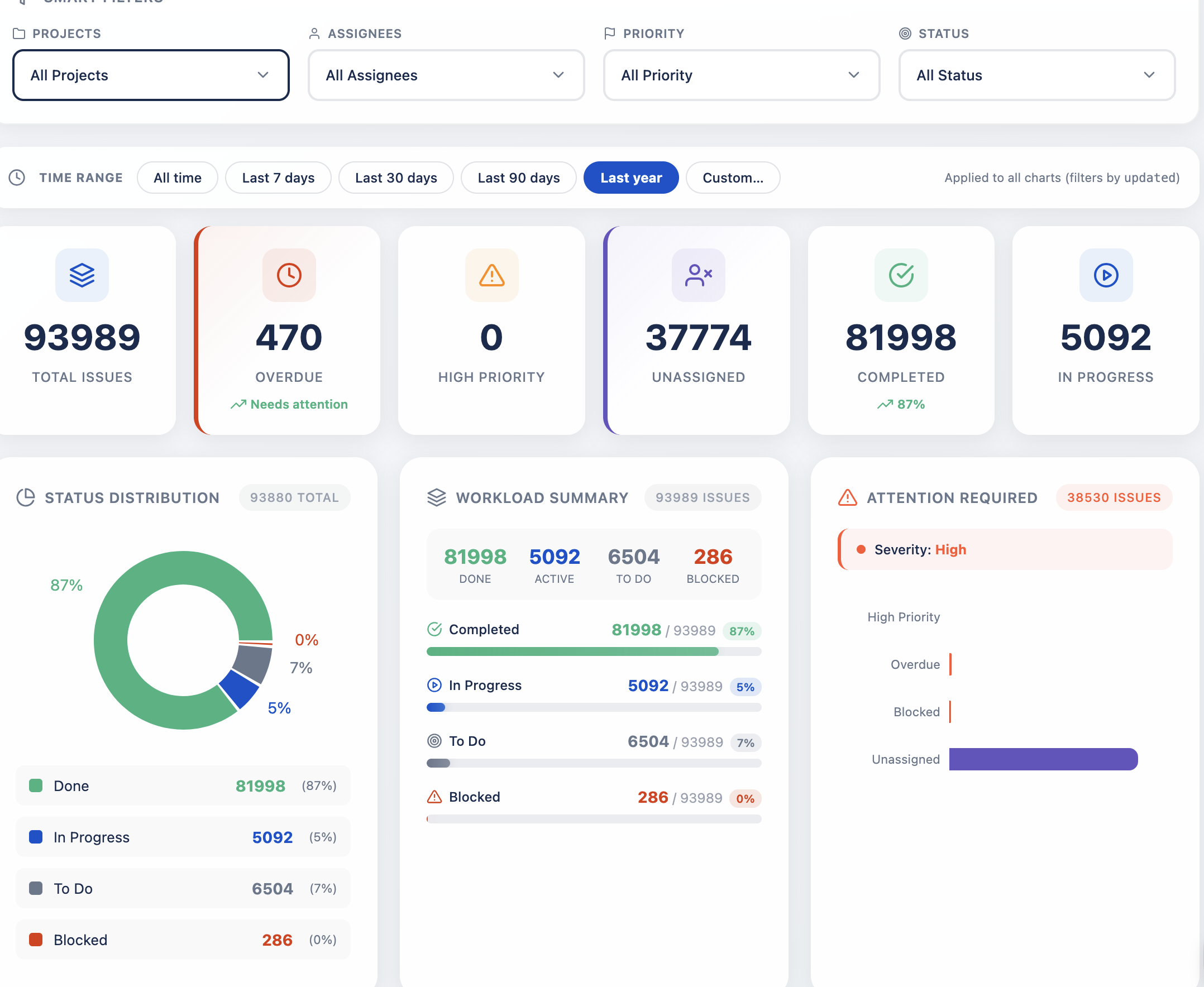
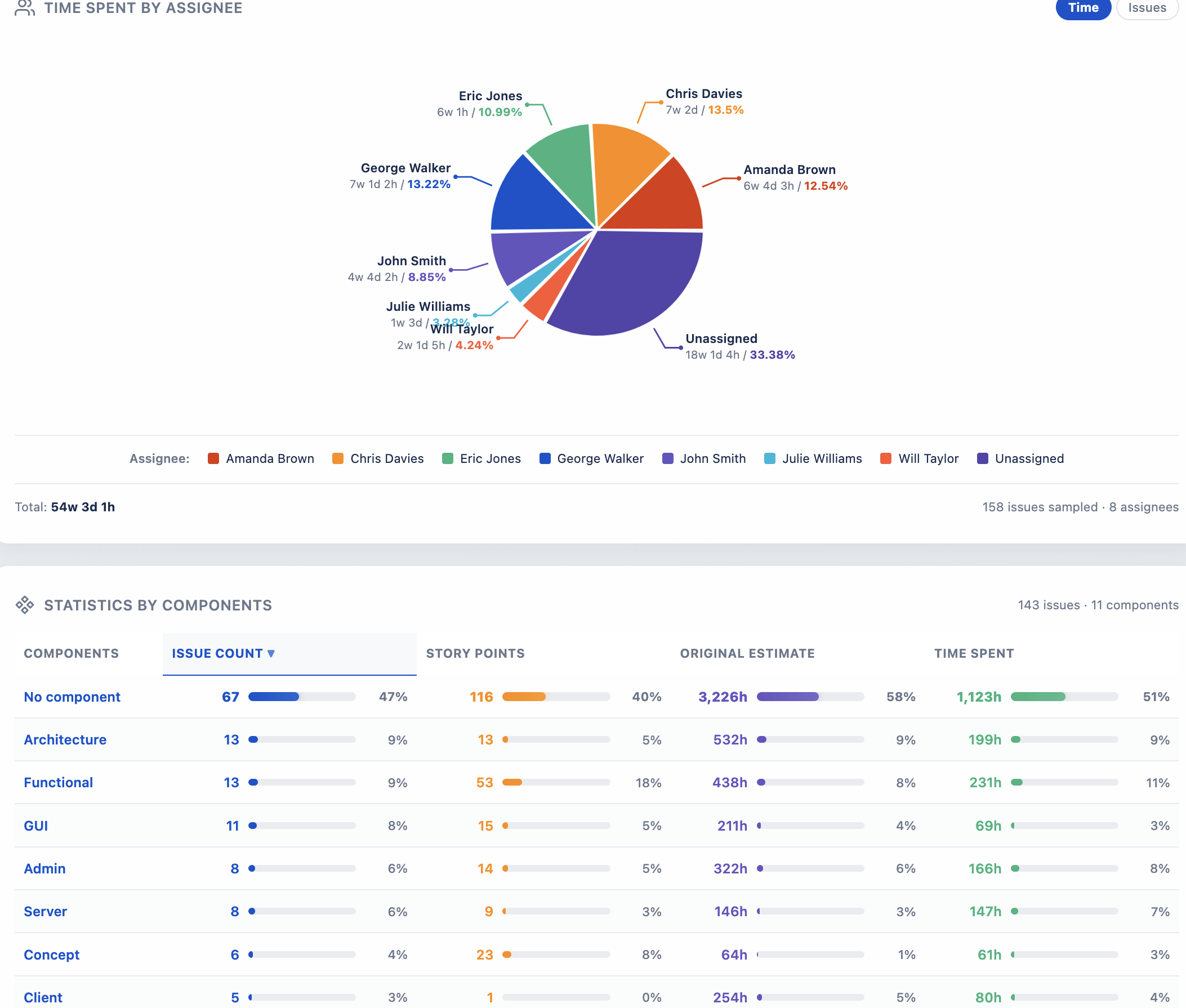
A premium dashboard gadget for Jira Cloud — engineered on Atlassian Forge to surface project health, sprint velocity, milestones, and risk signals through a single, sophisticated interface.
Each module is purposefully designed to answer a specific question your stakeholders ask — without leaving the Jira dashboard.
A single source of truth for the question every PM dreads: "Where do we actually stand?"
Aggregates completion rates, overdue items, blocked tickets, and unassigned work into a consolidated scorecard. Color-coded indicators surface what needs attention before the next stand-up — eliminating the manual JQL queries that drain twenty minutes from every status meeting.
When you steward ten projects, scrolling through ten Jira boards isn't a strategy — it's a tax.
Portfolio Overview rolls up multi-project status, resource allocation, and delivery pace into one consolidated panel. Drill from the portfolio view straight into the underlying issues with a single click — keeping leadership conversations focused on outcomes rather than ticket archaeology.
A boardroom-grade fishbone for the risks hiding in your backlog.
Categorizes signals across People, Process, Quality, and Schedule — automatically derived from issue patterns such as bug fix rate, blocked items, and sprint slippage. The result is a visual conversation starter your engineering leads can take into a steering committee without rebuilding the slide.
Note: Risk analysis is provided as a reference tool and should be validated by project teams.
Every release deserves a clear story arc — not a spreadsheet.
Visualizes upcoming, overdue, and released milestones along a chronological timeline anchored to today. Counters surface the totals that matter — 20 total · 20 upcoming · 20 overdue · 0 released — paired with a scrollable list of versions ready for grooming or executive review.
Workload concentration is the silent killer of velocity. Visualize it.
Decomposes your project into its component teams or modules, surfacing distribution across status, priority, and assignee in a single sortable matrix. Identify which corner of the codebase is carrying the load — and which is being neglected — long before retrospectives reveal it the hard way.
Where the hours actually went — visualized in a single elegant chart.
Aggregates Jira worklogs by team member, exposing effort distribution across the people doing the work. Catch silent overload, surface unbilled time, and rebalance the next sprint with data instead of intuition. Filter by time range — last 7 days, 30 days, this quarter, or any custom window.
A single filter panel powers every chart in the gadget — change one selection and every visualization re-renders in step.
Filter by projects, assignees, priorities, and statuses simultaneously. Selections compile to JQL automatically.
Every chart on the dashboard shares the same filter state. One click updates the whole view.
Last 7 days, 30 days, 90 days, this year, or a custom date window — applied across every visualization.
Stay current with a chronological stream of issue updates, status changes, and team movement.
Created vs. resolved over time — spot patterns, surface bottlenecks, and forecast outcomes earlier.
Active sprint burndown, story-point completion, and velocity trends in a compact, glanceable card.
Runs in Atlassian's sandbox. Read-only scopes. No external egress. No customer data leaves Atlassian.
Built-in demo data lets prospects and new admins see every chart light up instantly — no Jira setup required before evaluating.
Volume discounts at every tier. Billed monthly through the Atlassian Marketplace alongside your other Cloud apps.
Install Dashboards Rich Filters from the Atlassian Marketplace and try every feature free for 30 days — no credit card required.
Short, factual answers — also exposed as schema.org/FAQPage for Google AI Overview and assistants.
Dashboards Rich Filters is a Jira Cloud dashboard gadget built on Atlassian Forge. It turns the standard Jira dashboard into an executive cockpit with multi-select rich filters, real-time KPIs, sprint burndown, Ishikawa (fishbone) risk analysis and PMO program-health insights.
No. The app is Jira Cloud only because it is built on Atlassian Forge, which is a Cloud-only platform.
Free for installations with up to 10 Jira users. Above that, a 30-day free trial applies, then per-user tiered pricing from $0.91/user/month at the 11–100 user tier, decreasing at higher tiers down to from $0.48 at the 7,501+ tier. Billing is handled through Atlassian.
None. The app runs entirely on Atlassian-hosted Forge. It stores only an anonymous installation timestamp. No personal data is collected and no data is transmitted to third parties.
Install Dashboards Rich Filters from the Atlassian Marketplace and add the gadget to any Jira dashboard, or open the Rich Filters Dashboard entry under the Apps menu. The Risk Analysis section automatically categorises your Jira issues across People, Process, Quality and Schedule branches.
They are independent products from different vendors. Dashboards Rich Filters bundles native multi-select filtering with built-in analytics (KPIs, sprint burndown, Ishikawa risk diagram, milestones timeline) and a full-page Apps entry — features the RVS app does not provide.
Dashboards Rich Filters is a complete Jira Cloud reporting suite for PMO, agile delivery and engineering leadership — built natively on Atlassian Forge so nothing leaves your tenant.
Multi-select filters for project, assignee, priority, sprint, status, label, component, epic, fix version and custom JQL. Filters cascade across every chart on the dashboard.
Live counters for open / closed / overdue / blocked issues, bug-vs-story ratio, escaped defects, SLA breaches, release readiness and OKR progress.
Sprint burndown, velocity, cumulative flow (CFD), cycle time, lead time, throughput, and control chart — without leaving the Jira dashboard.
Ishikawa fishbone diagram auto-categorises Jira issues into People, Process, Quality and Schedule branches for retrospectives and PMO reviews.
Milestone timeline, Gantt-style roadmap, workload heatmap and status distribution — give executives the program-health view they actually ask for.
A dedicated Apps → Rich Filters Dashboard entry gives executives a full-screen cockpit alongside the dashboard gadget.
100% Atlassian Forge — no external server, no database, no PII. A modern alternative to eazyBI, Custom Charts, RVS Rich Filters and Power BI connectors for Jira.
Project managers, PMO leads, scrum masters, delivery managers, engineering directors, release managers and Jira admins reporting upward.
Keywords this app helps with: Jira KPI dashboard, sprint burndown chart, velocity report, cumulative flow diagram, cycle time, lead time, throughput, Ishikawa fishbone, root cause analysis, risk register, milestone tracking, Gantt roadmap, workload heatmap, status distribution, priority breakdown, overdue issues, blocked issues, escaped defects, bug ratio, SLA, release readiness, OKR tracking, PMO reporting, portfolio dashboard, executive dashboard, agile reporting, scrum master tools, Forge app, Runs on Atlassian, eazyBI alternative, Custom Charts alternative, RVS Rich Filters alternative.